
Dear Colleagues,
I performed some type of PCA analysis, which is called Multiple Factor Analysis (MFA). In general, it is defined similarly to PCA with one difference comprising the use of categorical or mixed data instead of continuous only. However, both PCA and MFA results are very mysterious as I could not find any source that would explain the meaning of "dimensions". I read many manuals etc, and I found that interpretation of x and y axis (called the dimensions) is very elusive (or am I wrong?). They present mathematics and general principle of the method, but it is not sufficient for me. I.e. I was trying to crack the sample dataset with descriptions, which the authors provided. The data regarded odor of wines before and after shaking (it is referred here: http://factominer.free.fr/advanced-methods/multiple-factor-analysis.html). What I cannot understand is how they deduced that x - axis means "intensity" and "harmony"? Therefore I cannot refer it to my data and my results.
Please, give me anything in simple terms or any source that could me more useful.
Thanks in advance.


Thank you very much guys. Now, I get this method more, but still the interpretation remains difficult as it is not black or white, like other statistics. My data are quite complicated, so the understanding of the dimensions is challenging.
Cheers.
Yes, it is not always easy to understand what's going on in your data. Note that PCA is very sensitive to outliers so log-transformation (or square root transformation) of variables with long tail distribution (such as count data usually) can help in finding patterns.
Thank you. I will consider additional data transformation, nevertheless the results are quite good.
Now I am facing another difficulty, which is the plotting of my results. In more details, I would like to plot 3D graph. I saw the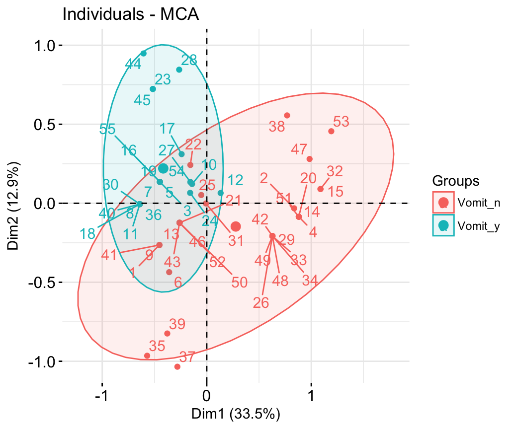 Now, I would like to see, how does it look in 3D, so I wanted to add the third dimension data from analysis to my graph. But,
rglpackage that plots the results of PCA, however it is hard to use on my data (which are mixed, categorical with continuous). As I mentioned before, I performed MFA (Multiple Factor Analysis fromFactoMineRpackage). My input data was continuous: expression of particular genes in patients group, and categorical: y-if patient experienced relapse or n-if not. Therefore, I obtained the results divided into two groups: 1) with relapse and 2) with no relapse. The example looks like:factoextracannot do this (as it just draws two dimensions) andrglpackage cannot do it as well, because it just plots continuous data with no regards to relapse. Is there any solution of this issue? I mean any package that I didn't saw, or just another way to present it.Thanks in advance.
Sorry, I don't know much about 3D plotting. But be aware that when you plot something in 3D, you create a visual distortion making it impossible for the reader to assess the exact coordinates of the points. And in 2D, you can always plot Dimension 3 vs Dimension 1 or 2.