Blog:Your input into Ensembl's new design
1
2
Entering edit mode
4.9 years ago
Emily 23k

Work continues on our exciting new website, which is available as a pre-alpha release. We’ve been consulting with some of you in various ways, such as interviews and meetings, because we want to make sure that the new Ensembl serves your needs. We’re now asking for your help with a short survey, which will just take a couple of minutes to fill in. Plus, you can enter into a draw to win an EMBL-EBI t-shirt.

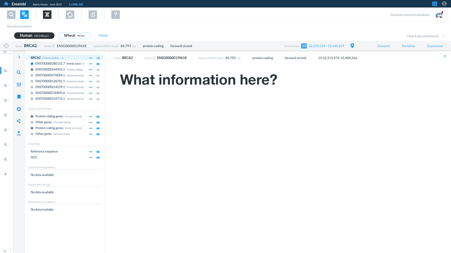
Our questions are simple: if you’ve clicked on something in the genome browser and you’re trying to decide if this is the one you’re looking for or not, what do you need to know?

screenshot

Start survey(https://forms.gle/6Bi66yNpS3z7wDib6)

ensembl web-design survey • 914 views
ADD COMMENT
0
Entering edit mode

I just completed the survey but wanted to pass along some comments.

  • It was difficult to see the images (they did not resize/became full size on a laptop screen).
  • It would be useful to know how a user is going to land at the page shown above (e.g. from a gene name search at the main Ensembl.org page?).
  • Many of the options we are being asked to choose from can be useful to see. If choice of max 4 some kind of design constraint?
  • It would have been good to see what the resulting page would look like in outline.
  • How many t-shirts are up for grab? Will you ship any where in the world :-)
ADD REPLY
0
Entering edit mode
  1. You don't really need the images, they give a little context but they're really only there to make it look pretty. I'll add a note to say that it might not work well on a phone/tablet.
  2. You would land there from clicking in a region. I thought I put that in the intro but I will check. It would then be easy to click back to the region and explore more, or, if you identify that this is what you're looking for, click through to the detailed information about the gene/transcript/variant.
  3. This is just supposed to be a decision making page, so we want it to all fit within the screen of a small laptop without any scrolling so you can just glance and click through or back. Four was a fairly arbitrary number, depending on what we choose we may be able to fit more or less than four items. We definitely wanted a strong limit on it, or many people would just tick everything and that wouldn't be useful.
  4. The resulting page is still under design, however it's something like the image shown, with a sort of key-value list in two columns under it. Under that would be nice shiny buttons to take you to detailed information like sequence or functional information.
  5. I think we said one t-shirt to start with, but we might rethink if gazillions of people fill it in. We're happy to post them anywhere.
ADD REPLY
0
Entering edit mode
4.7 years ago
Emily 23k

We will close this survey in a week.

ADD COMMENT

Login before adding your answer.

Traffic: 2841 users visited in the last hour
Help About
FAQ
Access RSS
API
Stats

Use of this site constitutes acceptance of our User Agreement and Privacy Policy.

Powered by the version 2.3.6