Generating manhattan plots with consistent scale
2
1
Entering edit mode
3.7 years ago
ika ▴ 50

Hey everyone,

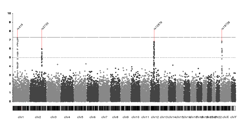
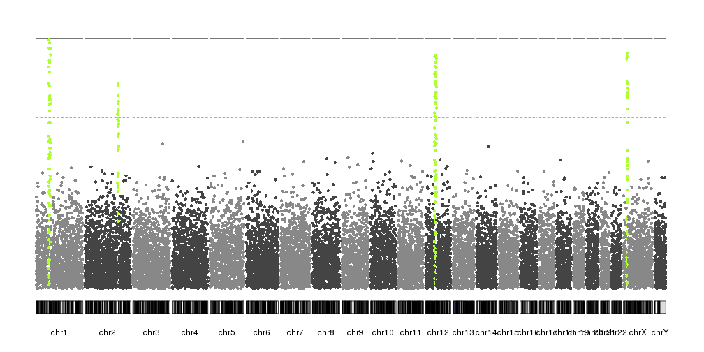
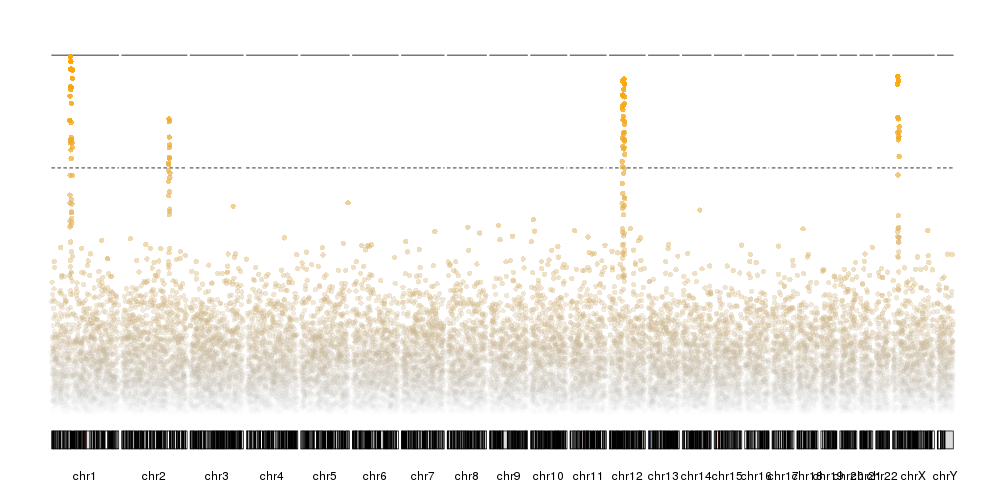
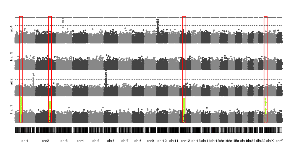
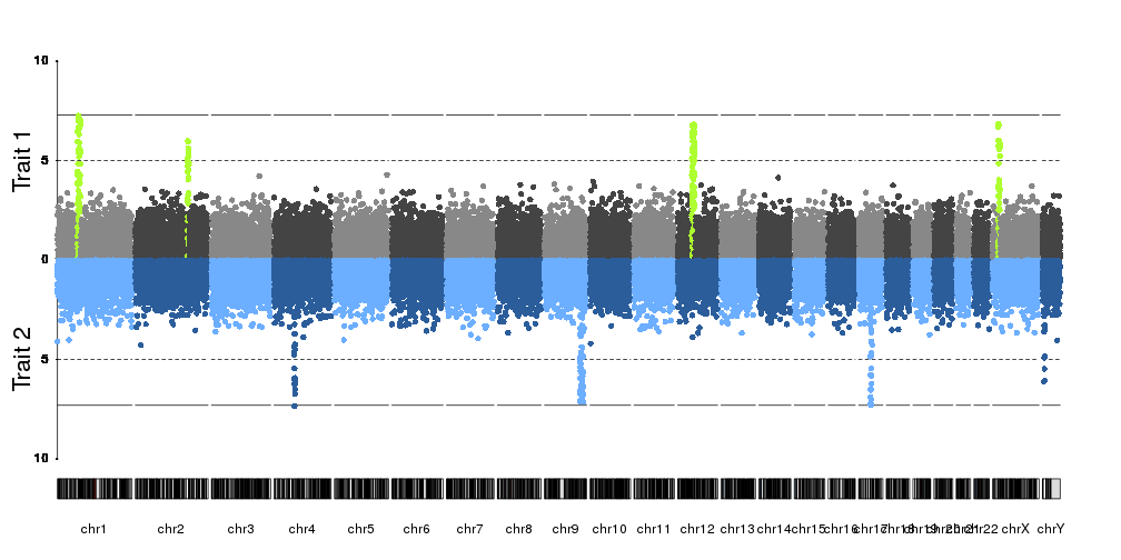
I've been trying to generate two Manhattan plots of different data sets to compare. However, one problem I'm facing with e.g. qqman and other R plotting scripts I've tried is that the plots don't align when e.g. overlaid (which is quite visible, as the boundaries of the single chromosomes are shifted). I assume this is because e.g. in data set 1, chromosome 1 contains data points from a certain positional range, whereas this range might be smaller or larger in the second data set. I've not been able to find a script that would allow me to set this range.

Is anyone aware of any Manhattan plotting software, scripts or packages that would be able to do this?

gwas manhattan R python • 2.7k views
ADD COMMENT
0
Entering edit mode

You might be able to plot this using a swarm plot from seaborn. This will pull y-values from a pandas dataframe column and give you something similar to what you want. You can also easily set the width that you feel your points need to stay between

ADD REPLY
0
Entering edit mode

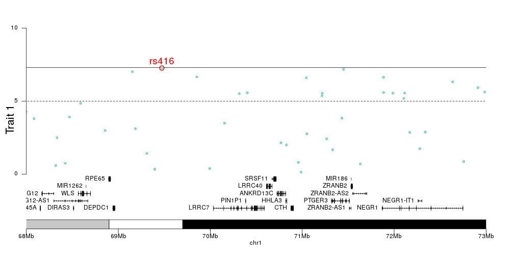
Can you share the problematic plot? I have trouble imagining the issue and I would think that most necessary tweaks could be achieved in qqman

ADD REPLY
1
Entering edit mode
3.6 years ago
bernatgel ★ 3.4k

HI ika,

You can use karyoploteR for this! Instead of plotting the SNPs one after the other equally separated, karyoploteR first creates a base plot with the correct chromosome sizes and then adds data to it. There are multiple functions to add different data types and there's one, kpPlotManhattan, to create manhattan plots. Since chromosome always have their "correct" size, you can overlay them, plot the together or simply compare them quite easily.

Actually, with karyoploteR you can directly create overlaid Manhattan plots with multiple datasets in multiple styles. You can find example in the karyoploteR tutorial page. Oh, and once you have your manhattan plot you can VERY easily create detail plots of smaller regions, add other data to them (e.g. genes, known susceptibility loci, etc...) and change their appearance quite a bit.

Here are some examples from the tutorial.

enter image description here enter image description here enter image description here enter image description here enter image description here enter image description here

ADD COMMENT
0
Entering edit mode
ADD COMMENT

Login before adding your answer.

Traffic: 1517 users visited in the last hour
Help About
FAQ
Access RSS
API
Stats

Use of this site constitutes acceptance of our User Agreement and Privacy Policy.

Powered by the version 2.3.6