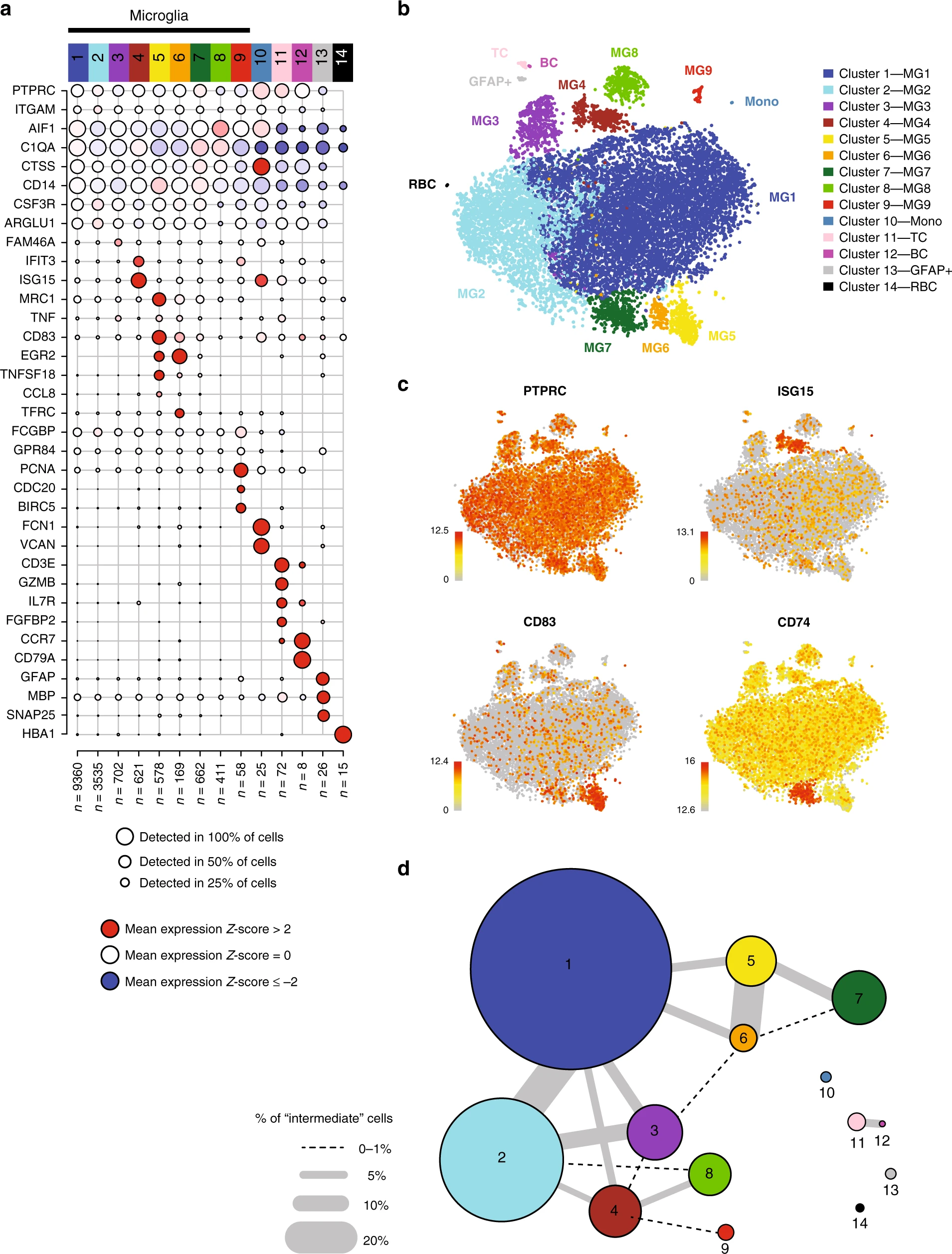
I like this dot plot (Figure a) for showing marker gene expression patterns for the clusters. Any ideas about how to make this plot with ggplot2? Some pseudocode would be enough.
Use dittoDotPlot from the dittoSeq package. Much easier than from scratch. The resulting plot is still a ggplot2 object, so you can customize as you'd like. Though the function itself is also quite flexible. Works natively on SingleCellExperiment, Seurat, or SummarizedExperiment objects and can use gene expression and/or continuous metadata variables as desired.
So all you'd have to do is grab your top 5 markers for each cluster or what have you and feed them in along with your data object:
That it does, if you're using Seurat. I like to think the dittoSeq version is more flexible given it handles metadata variables and multiple data formats, but I was involved in its development so I am a bit biased.
Hi Jared, since you are one of the developers of dittoSeq, is it possible to revise the dittoDotPlot function so that it makes the plot like the one in the example by default?
What do you mean exactly? I can tell you now that the cell numbers in each cluster are best added after the fact in Illustrator or your favorite figure editor. Getting the clusters labeled and oriented as in that figure would be something like:
I mean the aesthetics of the figure but I guess it's no big deal since the result is a ggplot object. Thanks. I already made the figure with your help.
It is possible in the normal Seurat DotPlot function but there I can't split by identities with facet... I'm struggling so much to find a way to get both
Jared poked me, and I started development on this feature =). You can try out the in-progress dev version by installing via remotes::install_github("dtm2451/dittoSeq@dotplot-categories")
Just wanna add another note about this: Although similar, there is a major implementation difference between how dittoSeq::dittoDotPlot() and Seurat::DotPlot() work if you are doing any subsetting to show only certain cell groups: Seurat's does all data summary and scaling BEFORE trimming to only your requested groups, while dittoDotPlot's implementation does the subsetting before calculating expression summaries and performing scaling. This let's subsetting be more flexible in dittoSeq's version. I'm just flagging this for when you or anyone else notice the two plotters give a different result -- Seurat's docs tend to be more sparse so I figured this out myself through trial-and-error!


Thank you, my friend. Sounds like a perfect solution to me. I’m trying it now.
harmony also might help here.
How so? Harmony has no viz functions.
I just noticed Seurat has a DotPlot function that does the same thing.
That it does, if you're using Seurat. I like to think the dittoSeq version is more flexible given it handles metadata variables and multiple data formats, but I was involved in its development so I am a bit biased.
Hi Jared, since you are one of the developers of dittoSeq, is it possible to revise the dittoDotPlot function so that it makes the plot like the one in the example by default?
What do you mean exactly? I can tell you now that the cell numbers in each cluster are best added after the fact in Illustrator or your favorite figure editor. Getting the clusters labeled and oriented as in that figure would be something like:
I mean the aesthetics of the figure but I guess it's no big deal since the result is a ggplot object. Thanks. I already made the figure with your help.
It would be so useful if it was possible to provide a named list of gene vectors, instead of just one. I mean like this:
dittoDotPlot( myRNA, list("A"=c("gene1", "gene2"), "B"=c("gene3", "gene4"), "C"=c("gene5","gene6")), group.by = "clustering") + scale_y_discrete(position = "right") + coord_flip()
It is possible in the normal Seurat DotPlot function but there I can't split by identities with facet... I'm struggling so much to find a way to get both
If you open an issue on the dittoSeq Github with an example of what you want, we may be able to implement it (or provide a way to hack it together).
Jared poked me, and I started development on this feature =). You can try out the in-progress dev version by installing via
remotes::install_github("dtm2451/dittoSeq@dotplot-categories")Just wanna add another note about this: Although similar, there is a major implementation difference between how dittoSeq::dittoDotPlot() and Seurat::DotPlot() work if you are doing any subsetting to show only certain cell groups: Seurat's does all data summary and scaling BEFORE trimming to only your requested groups, while dittoDotPlot's implementation does the subsetting before calculating expression summaries and performing scaling. This let's subsetting be more flexible in dittoSeq's version. I'm just flagging this for when you or anyone else notice the two plotters give a different result -- Seurat's docs tend to be more sparse so I figured this out myself through trial-and-error!