
Going through some of the instructions and tutorials for single cell mRNA-Seq analysis, I was looking for some solid and good looking gene expression heatmap plotting following pseudotime, where the gradual shift of transient expression could be clearly shown. Since monocle3 retired the plot_pseudotime_heatmap function, I haven't found any good examples of such function implemented anywhere. Maybe my sources are limited, here are some of the tutorials I've gone through:
https://satijalab.org/seurat/articles/get_started.html
https://cole-trapnell-lab.github.io/monocle3/docs/starting/
Do we only have the option to draw such heatmaps by custom code now? In R I could successfully obtain the feature (gene) expression matrix by pseudotime, but I had a hard time to order the features in a good way to show the desired effect of shifting expression through pseudotime, other than the hcluster process applied to the features. If anyone have any good suggestion on this, it would be great!
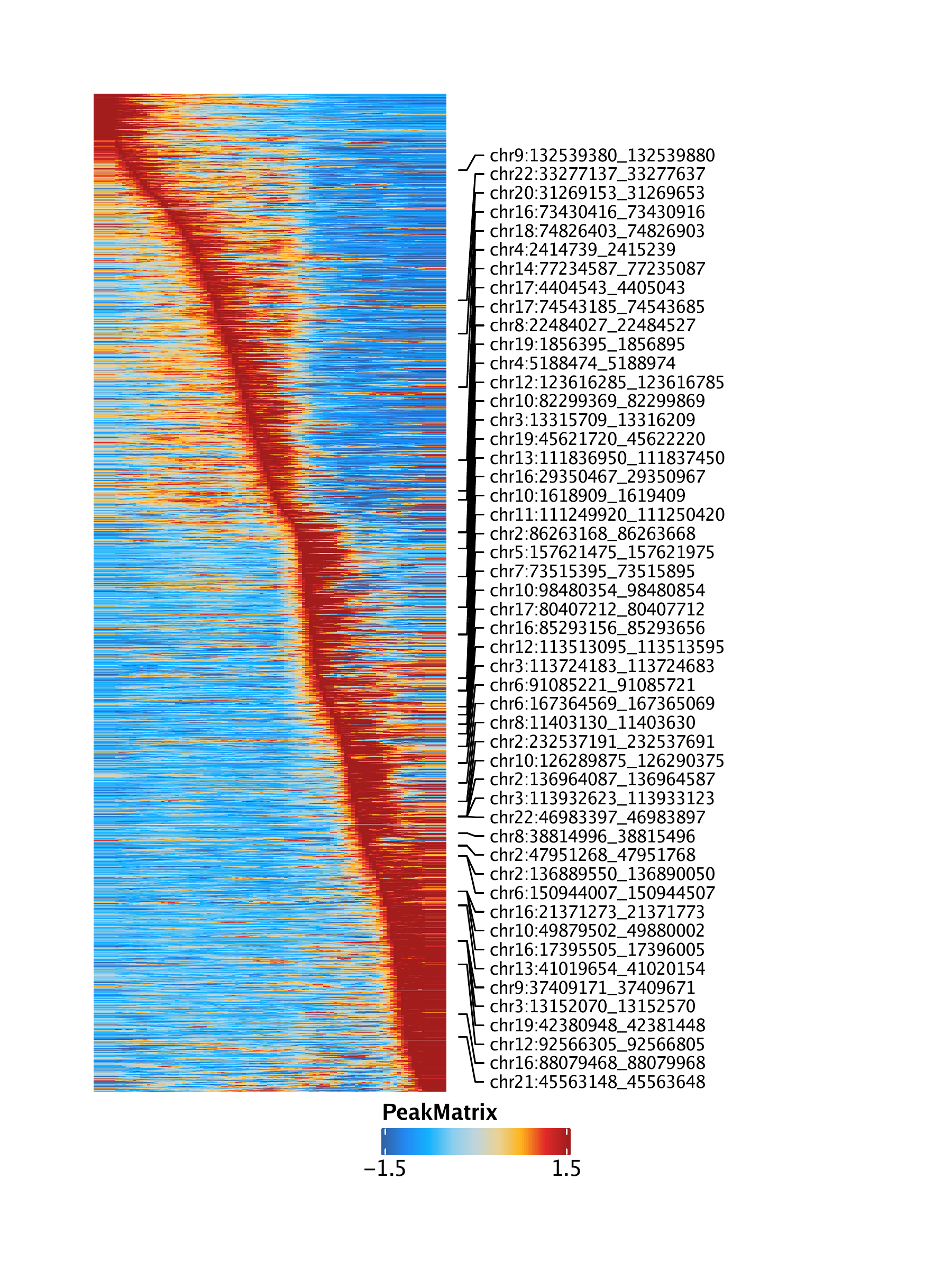
Here is an example of a similar heatmap. But this is from ArchR and single cell ATAC data. Is there something similar in single cell RNA analysis?
https://www.archrproject.com/bookdown/images/HemeWalkthrough/PNG/Plot-LymphoidU-Traj-Heatmaps_4.png


Can you provide an example of what you want the heatmap to look like?
I updated my original question with an example plot.
I also want a similar thing. Did you find any solution? Also could you please tell me how you obtained the feature (gene) expression matrix by pseudotime? I would really appreciate it if you share command(s) with me. Thanks in advance.
I've worked with a combination of R package Seurat and Monocle3. Following the instruction here (https://satijalab.org/signac/articles/monocle.html), we could obtain the trajectory inferred from Monocle3. With the new metadata column assigned with pseudotime, essentially every cell now has an additional identifier in the form of pseudotime values. We could access this additional metadata pseudotime by seurat.obj$traj.name.
Then we could obtain the expression (scaled from Seurat) matrix with "GetAssayData" function, keeping the column names (cell IDs), then replace the cell IDs with the pseudotime values. At this point, we have a expression matrix with features in rows and cells in columns (but in the form of pseudotime values), for which we could order the columns based on pseudotime. Now it's ready to plot the desired heatmap with features in rows and cells ordered in pseudotime in columns. I'll leave the detailed R code, as this would be a good practice to know the structure of a seurat and monocle cds object.
But the sticky point is how you order the features in rows. Looks like there is no good way other than simple hierarchical clustering for a better illustration of transient expression following pseudotime.