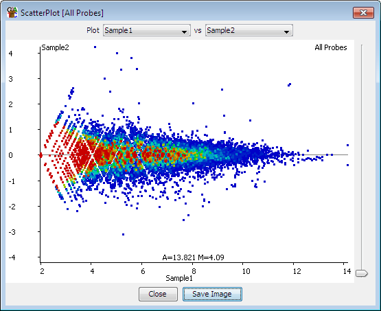
Hello guys, I am totally new for RNA-seq data analysis. Here is my dataset background. It has a five controls and five diseased samples. I am wondering is the MA plot good or are there mistakes and how do I interpret this graph. Can anyone guide me on this. Thanks a lot in advance!
Is your plot an MA plot though? The X axis should be log2 as well, yours seems linear. Apply the log2 to make your plot show the data as proper MA plots should.
The normal expectation is that at low A the M is more variable, since the errors are fixed when the values are small the errors are a higher percentage of the signal. This the expectation is that as you go to the right the plot tightens.
"an underlying assumption is that most of the genes would not see any change in their expression; therefore, the majority of the points on the y-axis (M) would be located at 0, since log(1) is 0"
An MA plot with a high number of data points falling above the one threshold on the y-axis would indicate a more significant number of genes being upregulated, while more below −1 would indicate high levels of downregulation in genes. Commonly, MA plots with have a fairly even dispersion relative to the y-axis, which tightens with an increase along the x-axis
Thanks a lot for your response. I had done deseq2 in the galaxy platform and you get a bunch of graphs along with the DEGs list, it was named as MA plot so I assumed it. Do you have any idea of what kind of plot it is.
Looks like a rather normal plot to me, in fact it is the default output from DESeq2::plotMA(). It does not really matter whether you log the baseMean itself or put the axis scale on log (here log base 10), both will stretch out the data so you can see differences over a large span of values.
What you can see is that many genes are not significant even though they have large(r) FCs and are not very lowly-expressed (so are not farleft), even though there are significant genes with low(er) FCs that are significant. That could be indicative of quite some variability in at least one of the experimental groups? Did you do a PCA up front and check for obvious outliers or batch effects? Which method was used to shrink the logFCs (normal, ashr, apeglm) in case you know?


Thanks a lot for your response. I had done deseq2 in the galaxy platform and you get a bunch of graphs along with the DEGs list, it was named as MA plot so I assumed it. Do you have any idea of what kind of plot it is.