How to plot/combine biological replicates on a genomic features plot for methylated array?
1
0
Entering edit mode
2.7 years ago
Pratik ★ 1.0k

Hello Biostars Community,

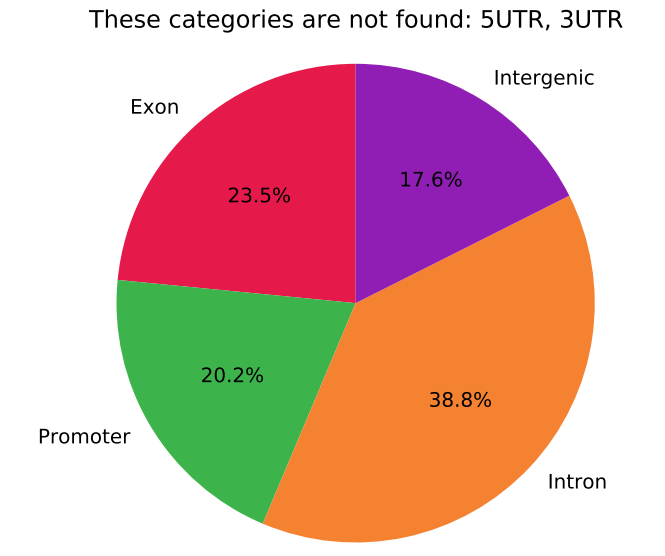
How would I plot biological replicates on a genomic features plot for methylated array?

Should I plot the mean from all the samples for each probe? or would it be better to plot each biological replicate separately? Hoping there is a way to combine them so it's concise in a way?

I want to plot figures like this: What cut-offs to use for Genomic Features Pie Chart for Methylation Array Data?

enter image description here

enter image description here

Thank you in advance : )

array methylation beadchip plot features genomic • 1.2k views
ADD COMMENT
2
Entering edit mode
2.7 years ago
Papyrus ★ 2.9k

This depends a lot on your goal. If you just want to show, across your data in general (or maybe between different groups), how methylation is distributed across genomic features, I would pool the information on the biological replicates, yes. But it is not necessary to do any operation (like you suggested, means across each CpG) for the plots. Simply concatenate all the data for the replicates. For example, using ggplot2 in a tidy data format, you will have to input something like this:

cpg sample  value   genomic_feature
cg1 A   0.2 promoter
cg2 A   0.8 exon
cg3 A   0.1 intergenic
cg1 B   0.3 promoter
cg2 B   0.9 exon
cg3 B   0.2 intergenic
…   …   …   …

Thus, when representing the boxplots, violinplots, separating by genomic feature, the data across the replicates will be pooled

ADD COMMENT
0
Entering edit mode

I really appreciate you going above and beyond to help me Papyrus! I have a couple different groups and each group has more than a couple biological replicates. Is mean/average a good way to pool together the biological replicates? Or is there a better way?

Thank you again. Really looking forward to your response!

ADD REPLY
0
Entering edit mode

You can take the mean/average to pool the replicates, and it is OK. Nonetheless, you have another option which does not involve losing/pooling information across the replicates. As I said, if you directly input all the replicate points (without taking the mean) into the boxplot/violin plots, the results should be pretty similar, because you have many CpGs and most are correlated between your replicates. You can check the two approaches.

Try this example in R:

library(ggplot2)

# Example input data

# Create methylation values
sample1 <- rbeta(10000, shape1 = 0.2, shape2 = 0.2)
sample2 <- sample1 + rnorm(10000,0,0.01)
  sample2[sample2 > 1] <- 1
  sample2[sample2 < 0] <- 0

data <- data.frame(
  cpg = rep(paste0("cg",1:10000),2),
  sample = c(rep("A",10000),rep("B",10000)),
  value = c(sample1,sample2),
  genomic_feature = sample(c("promoter","exon","intergenic"),20000,replace = T)
  )

# Plot
ggplot(data,aes(x = genomic_feature, y = value)) + geom_violin() + geom_boxplot(width = 0.2)

# Take the mean across replicates
data2 <- data[1:10000,]
data2$value <- (data$value[1:10000] + data$value[10001:20000]) / 2

# Plot
ggplot(data2,aes(x = genomic_feature, y = value)) + geom_violin() + geom_boxplot(width = 0.2)

# And for pie charts: example "low" methylation CpGs
ggplot(data[data$value <= 0.2,],aes(x = factor(1), fill = genomic_feature)) + geom_bar(width = 1) + coord_polar("y")
ggplot(data2[data2$value <= 0.2,],aes(x = factor(1), fill = genomic_feature)) + geom_bar(width = 1) + coord_polar("y")
ADD REPLY

Login before adding your answer.

Traffic: 1963 users visited in the last hour
Help About
FAQ
Access RSS
API
Stats

Use of this site constitutes acceptance of our User Agreement and Privacy Policy.

Powered by the version 2.3.6