I think I was able to recreate this genome dinucleotide frequency plot in R (more or less). Here is a full working example that you should be able to mess around with yourself. (There is a brief explanation after the code block.)
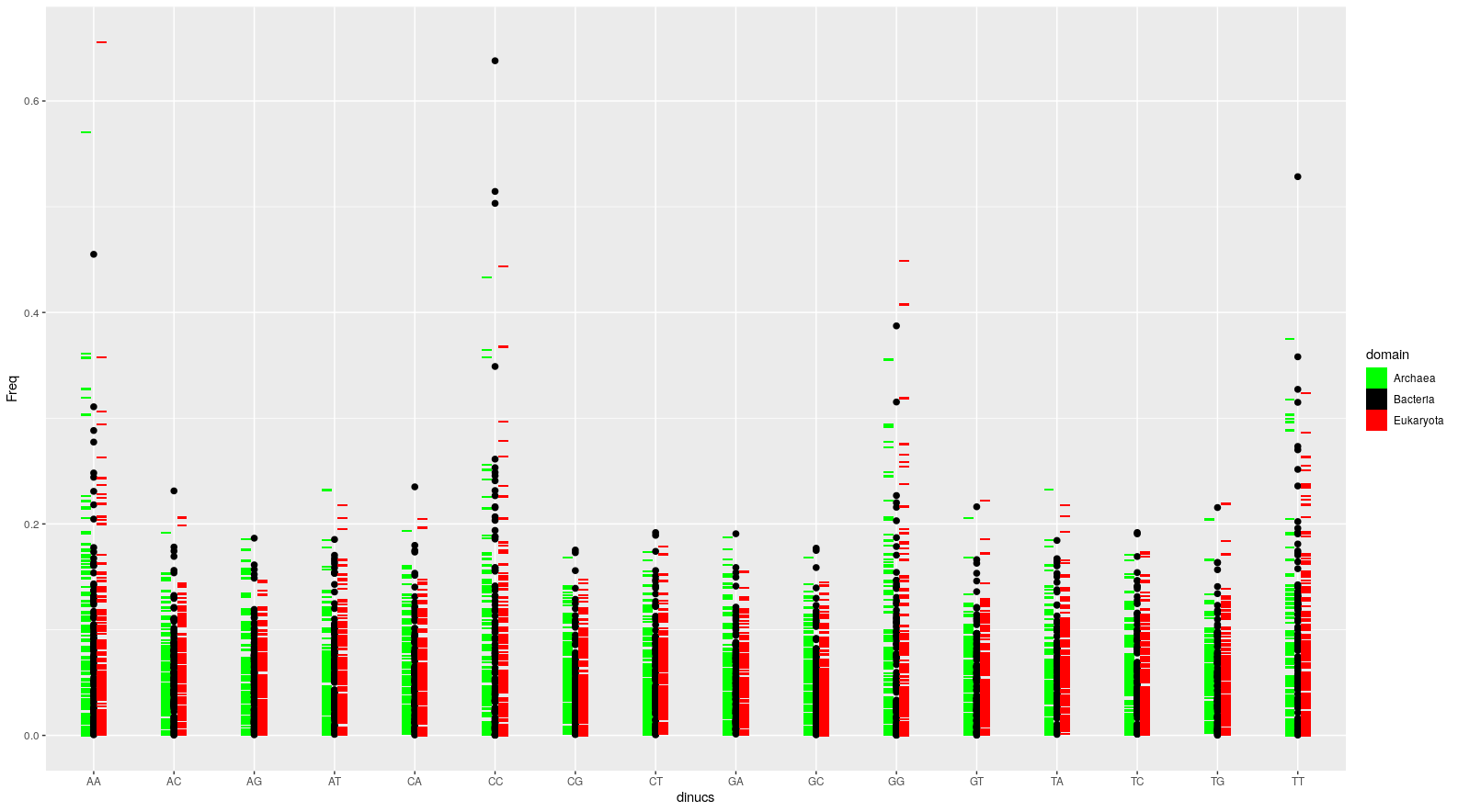
Here's what my version of this plot looks like:
And here's the R code.
#--------

#AUXILIARY FUNCTIONS.

#Probabilities for the bases.
rprobs <- function(n = 4){
  x <- runif(n)
  x <- x/sum(x)
  return(x)
}

#Genome simulator
genosim <- function(genlen = 1000){

  genome <- paste0(sample(c("A", "T", "G", "C"), size = genlen, replace = TRUE, prob = rprobs(4)), collapse = "")

  return(genome)
}


#Dinucleotide simulator.
dinucsim <- function(genomelen = 1000){

  #Simulating a genome.
  mygenome <- genosim(genlen = genomelen)

  #Using substring() to extract all dinucleotides.
  #This is possible because the function accepts vector inputs
  #for the first and last positions indicating the substring.
  n <- 2
  dinucs <- substring(mygenome, 1:(nchar(mygenome) - n + 1), n:nchar(mygenome))

  #Counting instances of each dinucleotide, converting into data.frame,
  #and getting relative frequencies.
  dinucs <- data.frame(table(dinucs), stringsAsFactors = FALSE)
  dinucs$Freq <- dinucs$Freq/sum(dinucs$Freq)

  return(dinucs)
}


#--------


#Simulating 400 genomes worth of dinucleotide frequencies.

#400 random genome lengths.
ngenomes <- 400
genomelens <- sample(1000:10000, ngenomes, replace = TRUE)

#400 sets of dinucleotide frequencies using these.
df <- do.call("rbind",
              lapply(genomelens, function(x){
                #Simulated dinucleotide frequencies for this random genome length.
                df <- dinucsim(genomelen = x);
                #Unique genome identifier.
                df$genome <- paste0("genome_", x);
                #Assignment to some random domain.
                df$domain <- sample(c("Bacteria", "Archaea", "Eukaryota"), 1);
                return(df)
                }
                )
              )

rm(ngenomes, genomelens)


#PLOTTING.

#Plotting the dinucleotide frequencies for these 400 genomes.
library(ggplot2)
ggplot() +
  geom_tile(data = df[df$domain == "Archaea", ],
            aes(x = dinucs, y = Freq, fill = domain),
            width = 0.125, height = 0.002,
            position = position_nudge(x = -0.1)) + #Archaea as geom_tile()s position-dodged to the left
  geom_point(data = df[df$domain == "Bacteria", ],
             aes(x = dinucs, y = Freq, fill = domain),
             size = 2,
             position = "identity") + #Bacteria as geom_point()s
  geom_tile(data = df[df$domain == "Eukaryota", ],
            aes(x = dinucs, y = Freq, fill = domain),
            width = 0.125, height = 0.002,
            position = position_nudge(x = 0.1)) + #Eukaryotes as geom_tile()s position-dodged to the right
  scale_fill_manual(name = "domain",
                    labels = c("Archaea", "Bacteria", "Eukaryota"),
                    values = c("green", "black", "red"), drop = FALSE)
I did this using ggplot2. In the plot from the OP, the genomes are grouped into domains. The trick was to supply the dinucleotide frequency sets grouped by domain as separate layers to ggplot(). In my example here, I passed one domain each as geom_tile()s and one (bacteria) as geom_point(). The other important trick was to position dodge the geom_tile() layers in opposite directions.


Could you possibly edit the title to read something like 'Can someone give me a direction on how to draw a figure like this one of dinucleotide frequency distribution pattern of genomes'? I think other people would benefit by being able to better find this thread as the search features won't be able to extract it from the image you posted.
@Wayne I will do that! Thank you for your attention. Paulo