Plotting a long string of (x,y) values as a chromosome
2
0
Entering edit mode
2.4 years ago
jafisep314 • 0

Hello everyone! I want to plot a huge CSV file with around ~100k rows and 2 columns. The first column refers to (ascending) coordinates on a chromosome, and the second column is either -1 or 1 (from grandpa or from grandma). Below is an example of a few rows.

14932   -1
14937   -1
15015   -1
16257   1
16487   1
20191   -1

Do y'all have any recommendations on how to plot this? I tried to do this as a scatterplot, with the coordinates (first column) as x, and the second column as y, but it does not turn out well as there are >100k rows. It will be great if I can represent the chromosome as a "line" but with the portions from grandpa (1) and grandma (-1) marked out. Thank you so much!

genetics genomics • 1.1k views
ADD COMMENT
1
Entering edit mode

I have a script here that I think may handle that or could be easily modified to do it. It handles individual chromosomes. There's an example of three in an image; however, it can do one as well.
Minor point: You data example looks like maybe TSV and not CSV?

(Oh yes, meant to add that definitely if you have that many points, you'll have issues trying to plot them all. Do you need it all though? With the human genome, I think I sample in the demo notebook for my script 10% of the points and plot them to get something that doesn't exceed the limited memory of MyBinder.org session instances.)

ADD REPLY
0
Entering edit mode

I tried to do this as a scatterplot,

which tool ? R ?

ADD REPLY
1
Entering edit mode
2.4 years ago

Because of the size of your dataset, there is no way you will be able to sensibly plot a chromosome as a line and fit in 100k+ points.

To plot all data, you need — at minimum — one pixel for each point, which would generate a >100k-pixel wide figure. That's simply not realistic to either fit on your screen or in a journal figure.

My recommendation would be to downsample or smooth the signal from your data into chunks or windows, and then plot those windows in a circular figure to maximize space usage:

  1. Turn your dataset into a BED file.
  2. Use the BEDOPS kit to chop up a chromosome into windows of some size (e.g., 1kb, 5kb, etc.) and calculate a mean or median value of signal from your dataset, over each chopped window. You might also look at taking the mode of the signal over the window, though for binary data (0/1 or -1/1) the median should equal the mode, I think.
  3. Use Circos to plot the windows into a circular layout.

There are too many steps to go over here, so if you go this route and get stuck, ask another question focused on a particular step and what you are doing to get the desired result.

ADD COMMENT
1
Entering edit mode
2.4 years ago
Dunois ★ 2.5k

You'll have to bin the data to plot them, as has been pointed out in another comment here. Then you could calculate the frequencies of the -1s and 1s, and visualize that as a line plot. Here's an example implementation in R (the only external package used here is ggplot2 for the visualization). The code should be (hopefully) self-explanatory.

#Toy data.
x <- sample(c(1:9999999), 100000, replace = FALSE)
y <- sample(c(-1, 1), 100000, replace = TRUE, prob = runif(2))
df <- data.frame(x = x, y = y)
df <- df[order(df$x),]


#Script really starts here.


#Change bin_size to control, well, the bin size.
bin_size <- 100000

#Counters.
curpos <- 1
max_val <- max(df$x)

#Aggergating counts over chromosome positions falling within
#bins defined by curpos and endpos.
while(curpos <= max_val){

  endpos <- curpos + bin_size
  if(curpos == 1){ 
    endpos <- endpos - 1 
  }

  #Get all genomic coordinates in this window into a temporary data.frame.
  curdf <- df[df$x >= curpos & df$x < endpos, ]

  #And their counts also.
  curdf <- as.data.frame(table(curdf$y))
  curdf$startpos <- curpos
  curdf$endpos <- endpos

  #Calculating midpoint value of the bin (for plotting)
  curdf$mid <- (curdf$endpos-curdf$startpos)/2 + curdf$startpos

  #Collecting this output for every bin into outdf.
  if(curpos == 1){
    outdf <- curdf
  } else{
    outdf <- do.call("rbind", list(outdf, curdf))
  }

  cat("Working on bin ", curpos, " -- ", endpos, "\n")

  #Updating position for next iteration.
  curpos <- endpos

}


#Plotting
library(ggplot2)
ggplot(data = outdf, aes(x = mid, y = Freq, color = Var1)) + 
  geom_line(alpha = 1.0) + facet_wrap(~Var1)

chrplot

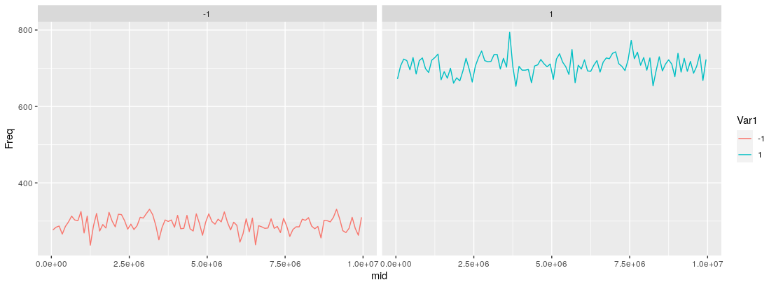
You could opt not to facet the output as has been done here, and just have the lines plotted in a single pane (just remove + facet_wrap(~Var1), and adjust the alpha in geom_line() if the lines overlap).

Was this what you were going for?

ADD COMMENT

Login before adding your answer.

Traffic: 2822 users visited in the last hour
Help About
FAQ
Access RSS
API
Stats

Use of this site constitutes acceptance of our User Agreement and Privacy Policy.

Powered by the version 2.3.6